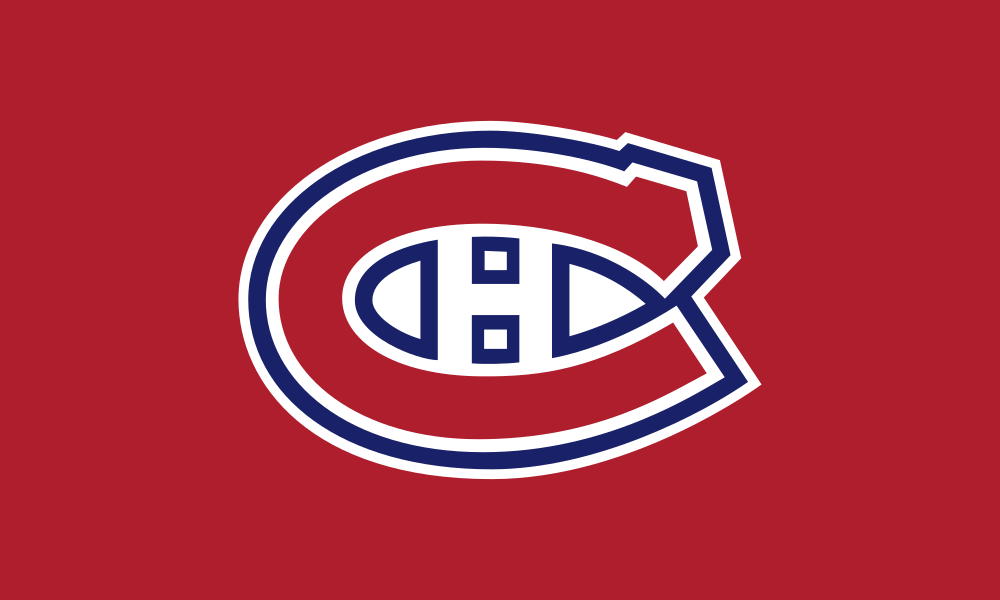
The Montreal Canadiens flag features three primary colors: Red, White, Blue. The table below showcases the common and popular codes for these colors in HEX, RGB, and CMYK formats, along with Pantone (PMS), RAL, and NCS (Natural Color System) references. Remember, HEX and RGB codes are ideal for digital projects and web design (including HTML and CSS), while CMYK values are tailored for printing purposes.
The Montreal Canadiens flag is a classic and distinguished symbol representing the professional ice hockey team based in Montreal, Quebec, Canada. The design of the flag reflects the team’s storied history, rich tradition, and deep connection to the city of Montreal and its passionate fan base.
Design Elements
- Color Scheme: The primary colors of the Montreal Canadiens flag are red, white, and blue. Red symbolizes passion, intensity, and the fiery spirit of the team and its fans; white represents purity, tradition, and the team's commitment to excellence; and blue conveys loyalty, strength, and a sense of pride in their French-Canadian heritage. These colors are central to the Canadiens' identity and evoke a sense of pride and unity.
- Logo: The centerpiece of the flag is the Canadiens' iconic "CH" logo. The logo features a large, stylized red "C" with a white "H" in the center. The "C" stands for "Canadiens," and the "H" stands for "hockey," reflecting the team’s core identity and their deep-rooted connection to the sport. The logo is outlined in blue, adding contrast and a distinctive look that has become one of the most recognizable emblems in professional sports.
- Background: The background of the flag is typically red, making the white and blue elements of the logo stand out prominently. The choice of red as the background reinforces the team’s identity and adds to the flag’s vibrant and energetic appearance.
- Additional Elements: Some versions of the flag may include the team’s nickname, "Habs," which is short for "Les Habitants," a term that connects the team to the early settlers of Quebec and their French heritage. This text is usually placed below the logo and rendered in white for high visibility against the red background.
Symbolism
- "CH" Logo: The "CH" logo is a powerful symbol of the team's identity and their connection to the city of Montreal and the sport of hockey. The stylized "C" and "H" have become synonymous with the Canadiens' brand and their rich history, symbolizing their enduring legacy and success in the NHL. The logo’s simple yet elegant design represents the team’s commitment to tradition and excellence.
- Color Scheme: The red, white, and blue colors reflect the Canadiens' deep roots in the Montreal community, their French-Canadian heritage, and their pride in representing both the city and the broader Quebecois culture. The colors also align with the flag of Quebec, further emphasizing their regional pride.
Cultural Significance
The Montreal Canadiens flag is more than just a representation of a hockey team; it is a symbol of pride for the city of Montreal and its residents. The Canadiens are the oldest continuously operating professional ice hockey team and one of the most successful franchises in NHL history, with a record 24 Stanley Cup championships. The team's history is marked by legendary players like Maurice "Rocket" Richard, Jean Beliveau, and Guy Lafleur, and the flag celebrates these historic achievements.
Overall Impression
The Montreal Canadiens flag is a classic and iconic emblem of one of the NHL’s most storied franchises. Its bold color scheme, distinctive "CH" logo, and deep symbolism create a memorable and culturally significant representation of the team. This flag serves as a proud banner for fans, symbolizing the Canadiens' identity, their legacy of success, and their strong connection to the city of Montreal, the province of Quebec, and the sport of hockey.
